

MAPA Brands is a company focused on the sale and customization of promotional products and merchandising platforms.
2021
2024
2021
2025
2024
2025
2023
2023
2022
2022
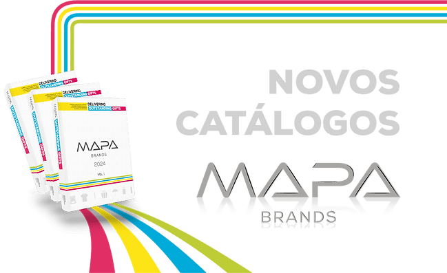
2025 is a year of
change for
This year, at the request of management and based on a predefined catalogue cover, by one of the suppliers (visible on the right), the brand image was reformulated again, abandoning the use of the 4 main colours (magenta, cyan blue, yellow and green) in exchange for green tones paired with vibrant colours.
Dynamic signage, iconography of "ecological hands", banners, etc., all communication was redesigned by me with the aim of creating a link between the catalogue cover and the general image of the brand.


The product budget proposal page was also redesigned, with the introduction of icons and automation of text insertion, through placeholders, connected to the budget files in Excel.
You can see the difference between the old page, which was already in use when I joined the company, and the new one, which uses much less text, in order to simplify the reading of each page.


Social media posts adopted a new square format that is standardized across all social networks, offering faster production.
The layout can be adapted and moved dynamically depending on the content and purpose of the post, including dynamic signage in product posts and even the possibility of presenting colors/functionalities of the products.
The contrast between dark green and light blue (both colors used on the cover of MAPA Brands 2025) highlights key words within the posts.
.png)
The Guiding Lines of
2024
For 2024, in order to maintain the previous year's communication line, the change was less significant, except for the dissolution of the paint as the main image, at the request of management. Now, the colored strip that presented the company's colors representative colors, in four transversal lines, occupies a central position in MAPA Brands' communication.
This style of communication also took hold in social media posts.
.png)
NEXT YEAR


Represented through ink
In 2023, I invest on a strong presence of the ink element as a representation of the brand's core activity (the personalization of promotional products), as well as the colors that represented MAPA Brands until then (magenta, cyan blue, yellow and green), using these same colors in the representation of eye-catching and, in some cases, animated visual elements.
For social media posts, I created a dynamic product showcase that, during seasonal times, included representative elements such as rain or snow in the case of Christmas.

The catalog, in contrast, followed a cleaner, more minimalist approach with the inclusion of 4 lines (which would come to represent MAPA Brands the following year), in the brand's 4 colors.
NEXT YEAR

new &
improved...
After the Not Digital rebranding not going through, I started studying new design trends and rethinking the brand's approach.
The main changes:
-
The logo, with the aim of improving readability while maintaining its personality.
-
The style of weekly email marketing and social media posts (implementing for the first time an animated product showcase and promotional videos through Motion-Design)
-
The style of banners used on social media.
-
Proposals were also presented for new 2022 catalogues, with a more "bold", eye-catching design, different from the previous ones and full of colour, with the aim of attracting attention to the brand.


An example of one of the most "bold" proposals for the 2022 catalogues, which subsequently followed a more simplified design chosen by the company .
Simplified design, chosen by the company, for use in the 4 volumes of 2022 catalogues, and then adapted for the Christmas catalogues.

One of the biggest changes however was, without a doubt, the introduction of "movement" to the company's static image.
The use of promotional videos and product animation (which often serves to demonstrate how to use the product) captured the customers attention, resulting in an increase in views of posts and email marketing.


Social media of
NOT Digital
At the beginning of 2022, the possibility of a rebranding of the MAPA Brands brand was announced, these are some of the tests I carried out for what would be the first social media posts for the launch of the Not Digital brand.
NEXT YEAR


Entry into the team
In 2021 I join the MAPA Brands team.
From then on, I was responsible for managing the website and social media, brand image, weekly marketing emails, product mockups, but above all, I was told to prioritize the graphical creation of budget proposals to present to clients. Meaning any design project would have to be interrupted if a new budget request was received.
The real challenge since then has been, always with uncertain time between the entry of a new budget, preparing everything that makes up the image of MAPA Brands.
The previous designer immediately gave me certain guidelines regarding the style of posts and banners on social media, the website and marketing emails.
Adding my own personal touch, I stayed within these rules until the end of the year, when I decided to propose a renewal of the brand's aesthetics.


The posts, banners, marketing emails and often the images of the products themselves are created by me, through image editing and manipulation using Adobe Photoshop and Adobe Illustrator.
Marketing Email Examples 2021
Social Media Post Examples 2021


Christmas Campaign

New Year 2022

Entering 2022, the world also enters a recession, new challenges arise, how to capture the interest of brands that are now struggling with cost containment?
The solution I found and proposed to the team was to renew the MAPA image, updating it with the new design trends that were coming in 2022.
Here, using Adobe Illustrator, Photoshop and After Effects, I free my creativity a little more and start to put into practice small promotional and product showcase videos through motion design, animated GIFs of product images and marketing emails with Call to Action buttons.